|
|
|||||||||
 |
|
|
|
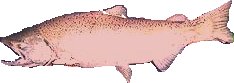
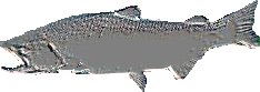
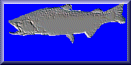
I had a little more fun using the filters and other editing tools. Let me explain a little about my project. I am a fishing guide during the summer. I am getting ready to redo our advertising page and thought it might be nice to have custom buttons for navigating the new site. What better than a salmon button. I found a picture of someone holding a salmon on the WWW. I used PSP to cut the salmon out of the picture. Then the fun started. |
|
|
||||||||||||||||||||||||||||||||
|
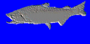
To big for use of as a button. Still, I liked the look and had ideas on what to do with it. Next up came sizing it for use in a button. |
|
|
|
||||||||||||||||||||||||||||||||||||||||||||||||||||
|
|

|